
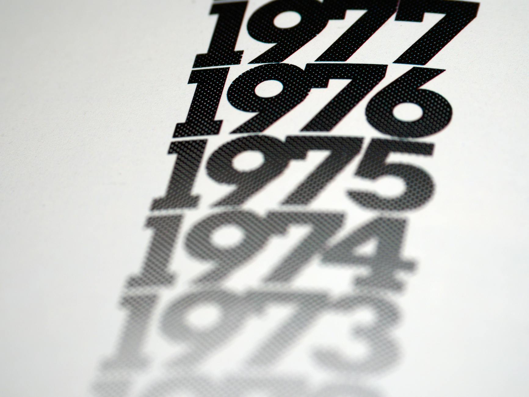
A title sequence has roughly 90 seconds to do something most scenes can't: set the emotional contract between the film and its audience before a single character has spoken. It's a compressed act of filmmaking in its own right, and the studios and designers who treat it as an afterthought are leaving one of the sharpest storytelling tools on the table.
What a title sequence actually does
The most common misconception about opening credits is that they're administrative. Name the director, name the cast, get out of the way. But the title sequences that audiences remember for decades aren't doing administration. They're doing orientation.
Saul Bass understood this earlier than almost anyone. His 1958 sequence for Alfred Hitchcock's Vertigo used spiralling geometric shapes drawn from a woman's eye to plant the film's obsession with repetition and disorientation directly into the viewer's nervous system. The audience hadn't met Scottie Ferguson yet. They didn't need to. Bass had already told them how this story was going to feel.
That's the first job: tone. A title sequence can establish whether a film is going to be cold or warm, comic or elegiac, intimate or operatic. It primes the viewer's emotional register before any narrative information has been delivered.
Visual motifs and foreshadowing
The second job is foreshadowing, and the best title sequences do it with enough subtlety that audiences only recognise it on a second watch. Kyle Cooper's sequence for Se7en (1995) embedded fragmented imagery of notebooks, razors, and stitched paper into a deliberately degraded visual texture. Nothing was explained. Everything was suggested. By the time the film's central horror arrived, the audience had been unconsciously prepared for it.
This connects to a broader principle in cinematic storytelling: the viewer's unconscious is a more receptive audience than their conscious mind. The cold open operates on a similar logic, dropping viewers into a scene without context and letting the brain work to catch up. Title sequences use the same mechanism, just with abstraction rather than action.
Thematic imagery can also plant ideas that pay off much later. A recurring colour, a shape that reappears in key scenes, a piece of music that later underscores a turning point: these connections don't require the audience to notice them consciously. They accumulate as feeling.
Music and motion: the inseparable pair
It's almost impossible to talk about a title sequence without talking about its score. The two are built together, and the music usually drives the cut. Kyle Cooper cuts to the grain and flicker of the Se7en sequence. Daniel Kleinman's Bond sequences are choreographed to the commissioned theme with almost mathematical precision.
The relationship between motion and music in a title sequence is one of the clearest examples of what film scores do to an audience's perception: the music doesn't accompany the visuals so much as it tells the viewer how to read them. Two sequences using identical imagery but different scores would produce completely different emotional responses. The score is the argument; the visuals are the evidence.
Tempo matters enormously. A sequence cut at 120 beats per minute tells the viewer something entirely different from one that breathes across long, slow dissolves. Pacing in a title sequence is a declaration of intent.
Typography as storytelling
Letterforms carry meaning independent of the words they spell. A serif typeface set in deep red over black reads differently from the same words in a clean sans-serif over white. The choice of typeface in a title sequence communicates period, register, and attitude before any word has been read as language.
Bass was also a master of typographic choreography. He didn't just choose a font; he animated letters as objects, gave them weight and momentum. Contemporary title designers like Prologue Films and Imaginary Forces have extended this tradition, treating typography as a sculptural medium rather than a labelling system.
The credits themselves, the names and roles, can be used as structural rhythm. When a name appears on screen, on what beat, in what position, for how long, shapes the sequence's pacing just as much as any visual element. Good title design treats the credits as compositional elements, not interruptions.
When title sequences disappear
Not every film uses a traditional title sequence. Some open with a single card and a cut. Christopher Nolan has famously minimal title cards. Many contemporary streaming productions front-load a cold open and push credits to the end. The decision to strip back the sequence is itself a stylistic statement: this film isn't going to ease you in.
The shift toward streaming has changed audience behaviour around opening credits. Skip-intro buttons exist for a reason: viewers have been conditioned by television to treat title sequences as something to get past. Film title designers are responding by making sequences more essential, more story-integrated, harder to skip without missing something. It's a pressure that's producing more inventive work, not less.
What production studios can learn from title design
The principles that make a great title sequence work apply well beyond the cinema. Any visual storytelling project, from brand films to documentary content, benefits from the same thinking: establish tone before you establish plot, use motif to create coherence, and treat typography and music as storytelling tools rather than finishing details.
West Melbourne Studios applies this kind of intentionality to every stage of a production. The decisions made in the first few seconds of any film, whether that's a feature, a commercial, or a brand video, set the terms on which everything that follows is received. Sound design, camera work, typography, and music aren't separate departments. They're a single instrument.
The title sequence is the sharpest proof of that. It has no plot to lean on, no character to carry it. It works entirely through craft. When it works, the audience doesn't notice it. They just feel ready for what comes next.