
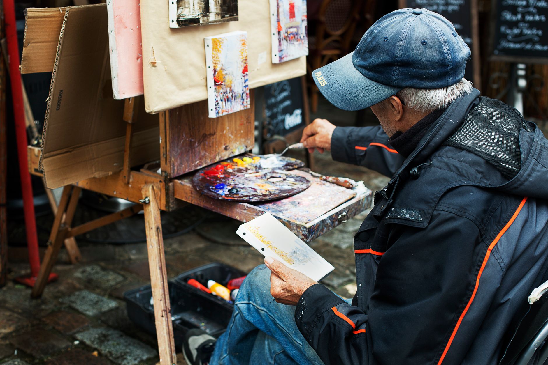
Before a director calls action, before a cinematographer frames a single shot, before a costume department pulls one garment from a rack, some films already know exactly what colour they'll feel. That knowledge lives in a colour script: a sequence of small paintings or illustrations that maps the film's emotional journey through palette, light, and saturation from the first scene to the last.
Pixar popularised the term. Studios like Illumination, Sony Pictures Animation, and DreamWorks Animation have used the format for decades. But the underlying discipline isn't limited to animation. Live-action directors and their production designers often build equivalent tools under different names: mood boards arranged chronologically, colour references organised by act, palette selectors tied to character states. The function is identical. Plan the emotion first, then figure out how to shoot it.
What a colour script actually contains
A colour script isn't a single image. It's a horizontal sequence of frames, usually painted loosely, that represents key emotional beats across the entire runtime. A 90-minute film might have 20 to 40 frames in its colour script. Each frame captures a scene's dominant palette, not its compositional detail.
The frames read like a timeline. Watch a well-constructed colour script and you see the film's emotional shape instantly: a warm, saturated opening that drains into cool, desaturated midpoints, then shifts again as the story resolves. Or a film that stays intentionally muted throughout, with a single burst of saturated colour reserved for a turning point that the audience won't forget.
That last technique is deliberate visual contrast. It's the same principle that makes colour grading so powerful in post-production, but applied before photography begins. The colour script is the promise the filmmaker makes to themselves about what the grade will need to achieve.
Why it matters more than a mood board
A mood board collects references. A colour script makes decisions. That distinction separates a decorative exercise from a genuine production tool.
When a colour script is done properly, it forces the creative team to confront a specific question: does this film's visual language actually support its story? You can write a script about grief and loss, assemble a beautiful mood board full of muted greys and slate blues, and still arrive on set with no coherent plan for how light and colour shift between scenes. The colour script eliminates that gap.
Production designers use it to align departments. Costume, set decoration, props, and the director of photography all need to know where the film is going tonally. Without a colour script, each department makes local decisions that can quietly contradict each other. With one, a costume designer knows that a character who begins the story in warm ochre tones is supposed to be wearing cool, unsaturated clothing by the third act. That arc is documented. It doesn't need to be re-explained in every meeting.
The role of the production designer in building the script
On most productions, the colour script originates with the production designer, sometimes in close collaboration with a visual development artist or the director. It isn't an afterthought assembled from reference images. It's painted or rendered deliberately, with each frame asking: what should an audience feel here?
The production designer works outward from the script. A scene where a character loses control might call for fractured, high-contrast lighting and clashing complementary colours. A quiet reconciliation scene might need analogous palette: colours close to each other on the wheel, nothing fighting for attention. Those decisions go into the colour script before a location is scouted or a set is built.
The parallel with other planning disciplines is worth noting. Just as animatics bring storyboards to life by adding timing and rhythm, a colour script adds emotional intention to what would otherwise remain an abstract creative vision. Both tools exist to make a film's plan legible to the whole team before the expensive work begins.
How live-action productions adapt the format
Animation studios have a structural advantage: every frame is drawn, so colour is a design decision from the start. Live-action productions work with found locations, natural light, and actors whose skin tones and costume choices interact with environments in ways no designer can fully predict.
That complexity doesn't make the colour script irrelevant in live action. It makes it more important. When a director of photography knows the emotional palette of each act, they can make lighting decisions that reinforce it. When a colourist in post-production understands the original intention, they're not guessing at the grade. They're executing a plan.
Some of the most intentional live-action films of the past 30 years have used this kind of pre-planned palette architecture. The controlled palette shifts in films like Her, Parasite, and The Grand Budapest Hotel didn't emerge from instinct alone. They came from directors and production designers who made palette decisions before principal photography, then held to them.
Character-based palettes and how they interact
A sophisticated colour script doesn't just track the film's overall emotional arc. It tracks individual characters. Each major character might carry their own palette: a set of colours that signal their presence, their psychological state, and their relationship to others.
When two characters share palette elements, the script signals alignment or connection. When their colours clash, it visualises conflict before dialogue does any work. When a character's palette shifts across the film, the audience registers it emotionally even without understanding why.
This is why colour scripts are inseparable from character design in animation, and from costume and production design in live action. The colours aren't decoration. They're a second layer of storytelling running beneath the dialogue and plot. Sound design operates the same way: audiences feel it before they consciously hear it. The craft behind both disciplines is explored in detail in the piece on how sound design shapes the viewer experience, and the parallels are instructive for anyone working in visual storytelling.
What happens when there isn't one
Productions without a colour script don't automatically fail. Plenty of strong films were made without formal colour scripting. But the risk is visible in the results: palette decisions made in isolation by different departments that contradict each other, grade choices that feel disconnected from the story's emotional shape, and scenes that look beautiful individually but don't accumulate meaning across the runtime.
Colour is cumulative. A single blue scene communicates nothing specific. Ten blue scenes leading to one golden one communicate loss and then relief. That arc only works if it was planned. Improvising it in the grade, after photography is complete, is expensive and often impossible when the source material doesn't support it.
The colour script is the cheapest investment a production can make in its visual coherence. It costs paint, time, and clear thinking. What it prevents costs far more.
Using colour scripts outside of feature film
The format scales down. Short films, commercial productions, branded content, and music videos all benefit from pre-planned palette thinking, even if the output isn't a formal illustrated sequence. A brand video built around three emotional beats can be colour scripted in an afternoon: what palette opens the piece, what shifts it in the middle, what palette closes it and leaves an impression.
West Melbourne Studios approaches colour planning as part of the pre-production process for cinematic projects, treating palette decisions with the same intentionality that the best feature productions bring to every visual choice. The colour script isn't a luxury. It's how coherent visual storytelling starts.